The Detroit Red Wings revealed a logo and other branding elements for their centennial season on Wednesday morning.
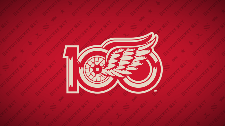
The centennial season logo is a mashup of the number “100” and the team’s first Winged Wheel logo from 1932, when they adopted the Red Wings name. The wheel from the Winged Wheel makes up the first zero, with the traditional wing coming off of it to the right. The wing overlaps the second zero, which retains some of the “wheel” decoration from the first zero but without the spokes. The one digit is a new creation, styled to match the other digits.
The logo appears in “Red Wings Red” and vintage white, as was used for the team’s 2014 Winter Classic jerseys.
The team also unveiled an “Cougar D” that does not match the one used by the team for the 2009 Winter Classic or as an alternate for the 2014 Winter Classic. Purposefully redrawn, “this updated version honors the team’s earliest identity while refining the letterform for modern use.”
Somewhat confusingly, the team’s branding announcement includes a logo timeline that makes use of the red and yellow Detroit Falcons logo. I’d previously written about how that logo appears to have never actually been used so this muddies the water a bit further.
Not included in the announcement was a version of the centennial logo using a standard white instead of vintage white. That version was seemingly leaked via an Upper Deck card set earlier this week.
The team did not reveal whether this logo will be worn on their jerseys for the coming season. They also did not unveil a centennial season jersey (though they did slip in mention of one being on the way).
I usually complain about graphic design coming from the Red Wings, whether it’s memorial logos or special jerseys, but I really like this logo. It’s simple and pays homage to their history.
I don’t love that they yet again re-drew the “Cougars D” (or that it doesn’t really match what the team was wearing at that time, but they never have matched that accurately).
I’m also reserving a little bit of judgement until we see how these logos are actually used.
I’ve already been talking to Chris Creamer from SportsLogos.Net about the yellow and red Detroit Falcons logo. His take is that the NHL (incorrectly) uses that version so the Red Wings carried forward from there. I can believe that but I’d feel a lot better if we could find an actual Detroit Falcons sweater and put that debate to bed.
Related Posts
-
 Nov 21, 2016
Red Wings Reveal Centennial Classic Jerseys
-
 Jun 25, 2012
Red Wings Winter Classic Jersey Concept #4
-
 Sep 7, 2002
Griffins Unveil Detroit-styled Jersey
-
 Aug 18, 2015
Griffins Unveil New Logo and Jerseys