The Red Wings sent out one of their periodic ticket sales email blasts this morning and something from it jumped out at me. A piece of merch; a red sweater with five stripes on the sleeves, seemingly in the style worn by the Detroit Falcons in the early 1930s.
I thought that design element was a little bit niche for them to be building merchandise around and suggested on social media that maybe it’s also part of the yet-to-be-released Centennial Season jerseys.
Just realized I’ve seen a few pieces of Red Wings centennial merch that feature sleeves with the striping pattern similar to the one that appeared on the team’s sweaters when they played as the Falcons. Strange element to suddenly bring back. I wonder if it features on the centennial jerseys.
— DetroitHockey.Net (@detroithockey.net) July 28, 2025 at 11:15 AM
I kept churning on that idea and, while looking for other anniversary season merch, ended up at the Red Wings’ centennial website, where I was surprised to see that the five-stripe pattern is also in use as a subheading decorator.
Screenshot from the Red Wings’ centennial website, showing the five-stripe pattern in use as a subheading and on merch.
That dual use of the pattern doesn’t mean that it will appear as part of the team’s Centennial Season jerseys but I think we’ve seen enough of the team’s event branding that we could make a guess about that.
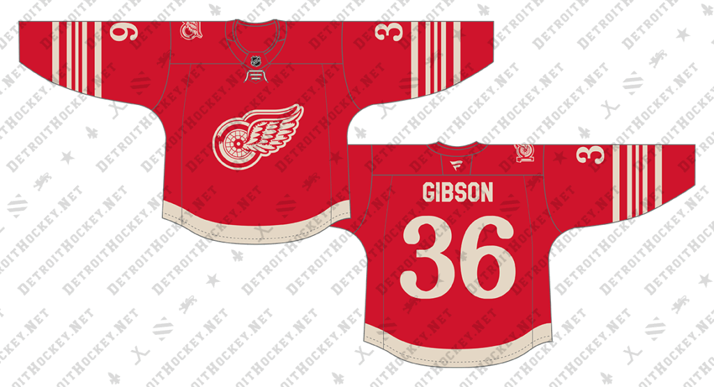
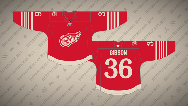
A Red Wings Centennial Season jersey concept, based on branding elements we’ve already seen.
Let me throw out some caveats before getting into it: Just because the Red Wings are using some of these elements in their web-based marketing doesn’t mean they’ll appear on the ice. All their branding and social media graphics last year featured those weird mis-matched fonts but they didn’t put lettering that looked like a ransom note on their sweaters. Additionally, even if these elements are used on a jersey, they may not be used like this. I’m just spitballing here. That’s why I’m calling this a concept and not a prediction.
We’ve already seen the team’s Centennial Season logo on the shoulder of jerseys given to their draft picks earlier this summer, so I think it’s safe to say it’ll appear in a similar fashion on the centennial sweaters as well. I put it on the opposite shoulder on accident but I don’t feel like re-drawing my image so just imagine a bit.
Given that the anniversary logo is built around what the team is calling the “Original Winged Wheel,” it seems likely that they’d use that logo as a crest.
The five-stripe pattern then goes on the sleeves, as it did when the team originally wore it.
A laced collar for a faux-back design is an obvious choice.
The team has been using a Bookman-like curly font in some of their marketing. It has an “old-timey” look and I’m guessing that it gets re-used for the jersey numbers. It doesn’t quite match what the team wore for the 2014 Winter Classic (or for the 1982-83 jerseys that inspired that touch) but it’s a similar vibe.
I didn’t think the curly font read well for a player name so I went with a standard block similar to what the team used on their Reverse Retro jerseys a couple seasons ago. I didn’t bother to draw it up but I also like the idea of a serifed font there, or something like Montreal’s nameplate font (which the Red Wings used for the 2009 Winter Classic).
Finally, I went with a single waist stripe in the style of the team’s current home jersey. The five-stripe pattern seemed way too busy to use there, though it’s how the team actually wore it in the 1930s. I also considered lifting the stripe off the hem, similar to the current road jersey or the red jersey from the mid-1980s.
I’m sure the ad patch would appear on the chest but I’m not going to include it here.
Again, I’m not saying that this is how it will be. I haven’t seen the Centennial Season jerseys. I’m just building something off of what we have seen.
Related Posts
-
 Nov 12, 2014
A Chicago Blackhawks What If Sweater Concept
-
 Jun 25, 2025
Red Wings Unveil Centennial Season Branding
-
 Jul 29, 2015
Red Wings Stadium Series Sweater Concepts
-
 Nov 21, 2016
Red Wings Reveal Centennial Classic Jerseys