The Detroit Red Wings unveiled a new alternate jersey on Monday as part of the celebration of their centennial season.
IT’S HERE AND IT’S BEAUTIFUL! pic.twitter.com/EBjhZ0vpWG
— Detroit Red Wings (@DetroitRedWings) September 15, 2025
It is the team’s first-ever full-time alternate sweater that isn’t part of a league-wide initiative. The Red Wings previously wore throwback jerseys for select games during the league’s 75th season (which were also used for a single game in 1994). They also participated in the league’s Reverse Retro program in the 2021 and 2022-23 seasons, in addition to wearing specialty designs for the Winter Classic in 2009 and 2014, the Centennial Classic in 2017, and the Stadium Series in 2016 and 2025.
The sweater design is a “fauxback” of sorts, featuring many elements that I had previously guessed might appear.
The base of the jersey is red, which was to be expected with the team planning to wear it primarily at home. Vintage white accents appear throughout the jersey.
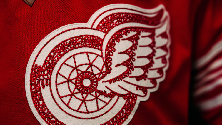
A version of their logo – which the team is calling the “Original Winged Wheel” – is used as the crest. Player numbers are in a font that the team says is inspired by the original sweaters of the Detroit Cougars, which is similar to the Bookman-like wordmark that the team uses today.
The sleeves and waist feature a five-stripe pattern based on one worn by the Detroit Falcons. That same pattern appears on some of the team’s Centennial merchandise and marketing.
Player nameplates appear to be straight, though using their usual font, while letters denoting the captain and alternate captains will appear in a diamond – as they did in the 1940s and 1950s – with a faux-leather treatment.
The team’s centennial season logo will appear on the left shoulder while the Priority Waste advertisement patch appears on the opposite shoulder. A retro-styled advertisement for Meijer appears on the helmets.
-
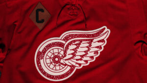
- The front of the Red Wings’ Centennial Jersey. (Credit: Detroit Red Wings)
-
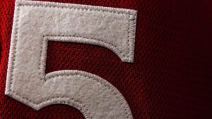
- The number style on the Red Wings’ Centennial Jersey. (Credit: Detroit Red Wings)
-
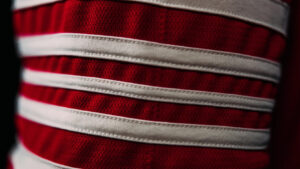
- The striping pattern on the Red Wings’ Centennial Jersey. (Credit: Detroit Red Wings)
The inside of the collar features a “Hockeytown” wordmark while the inside of the back hem lists the years of the team’s Stanley Cup Championships.
The jersey features a lace-up collar.
I usually don’t agree with the Red Wings’ design choices but I think they just about nailed this.
I don’t particularly like the Original Winged Wheel but that was always going to be the way the team went, so I can’t really fault them there.
I’m really surprised that they’re making so much out of the Falcons-inspired striping. I like it, and it’s another thing that makes sense given that they’ve already thrown back to just about every other jersey design they’ve ever had.
The “hanger effect” things are meaningless to me. I wish the “Cougar D” wasn’t relegated to a small hem tag and the pants but I don’t see where else it would have fit in this design, short of swapping it out for the crest.
This is probably my third-favorite of Detroit’s alternate jerseys, after the 1991-92 design and the 2009 Winter Classic.
Related Posts
-
 Jun 25, 2025
Red Wings Unveil Centennial Season Branding
-
 Jul 28, 2025
On a Red Wings Centennial Sweater Concept
-
 Nov 21, 2016
Red Wings Reveal Centennial Classic Jerseys
-
 Sep 19, 2024
Griffins Unveil New Jersey Designs