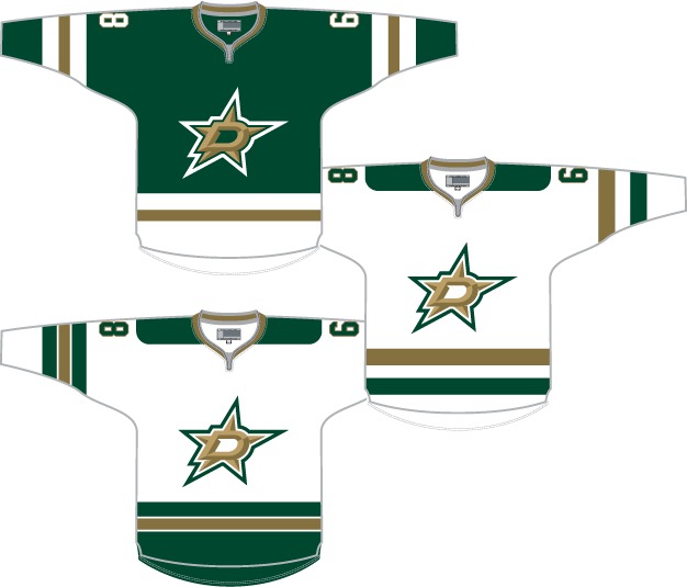
Since I wrote in January about the then-upcoming new logos and jerseys for the Dallas Stars, I figured I’d put something together now that they’ve been revealed.
Personally, I’m not a fan. The logo screams “arena football” to me and the fact that black was kept in the color scheme but gold was removed is disappointing. I don’t love the change to “victory green” or whatever their calling the new primary color but I loved their old green, so whatever.
I look at the new jerseys and I just see North Dakota. The entire identity seems derivative.
That said, I think they could have gone with some of the changes had they only kept the colors the same.

Had they dropped black, kept gold, and kept their previous green I think this set might have worked.
The first two are a simple palate-swap of their new jerseys, with gold replacing black in the striping pattern and grey removed. The third sees the light jersey based more on the dark jersey.
I removed the shoulder logo because I hate it. I could see the new pant logo (recolored of course) working as a shoulder logo but I also think the shoulders can be left blank.
As with my previous concepts, my template is a little flawed so the collar isn’t displayed quite right. I’d expect the lace-up collars actually unveiled tonight to be used. I was also lazy and kept Jaromir Jagr’s #68 on the mock-up from my previous design. It doesn’t mean anything.
I don’t entirely love these designs but I like them more than what the Stars actually went with. Not that it means anything.


