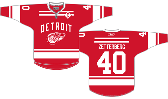
On and off since it was first announced that the Red Wings would host the 2013 Winter Classic, I’ve made attempts to predict what the team would wear for the game. With Sunday’s formal announcement that the cancelled 2013 event would be rescheduled for 2014 and the unveiling of the related uniforms, we know I got a couple things right but was mostly wrong.
Yeah, my first concept nailed the idea of the city name arched over the Winged Wheel. I also called the use of vintage white. That’s it, though.
In my defense, I didn’t think they’d make up an entirely new striping pattern. I like it, but I didn’t expect it.
I also didn’t expect that they would base the entire sweater around what I consider the worst design element the team has ever used: The “fancy” numbers from the 1982-83 season. As I’ve said previously, this is something that was such a bad idea it only lasted for a season. There is nothing particularly endearing about the Reed Larson-led 1983 lineup that this could be an attempt to evoke the memory of.
I won’t be buying one of these Winter Classic jerseys but if only they’d gone with a standard block font, they could have had something nice.

I think this is pretty self-explanatory. All uses of the “fancy” font are replaced with a standard block font. Additionally, the vintage white” (they’re calling it “antique white”) is replaced with standard white because they didn’t use a dark enough red to make the off-white work. The diamond-bordered captain’s C is kept but moved back to where it belongs, rather than being placed on the sleeve for some ungodly reason.
I think it works and I might actually pay money for something like this. What they actually produced, not so much.
Standard disclaimer from all of my concepts: I know the template isn’t quite right, specifically I’d expect a lace-up collar that isn’t shown here. I also left the Winter Classic logo off the shoulder out of laziness. I will say I love the placement of that patch on the shoulder, but that might be because the Wings never have a shoulder patch so it’s something new.
For the record, here are the links to my previous Winter Classic concepts…
Concept #1 (February)
Concept #2 (May)
Concept #3 (June 4)
Concept #4 (June 25)
Concept #5 (July)
Concept #6 (August 6)
Concepts Revisited (August 23)
Concepts Revisited Again (January 5)


