
A week ago the Grand Rapids Griffins raised the banner for their first-ever Calder Cup Championship. It’s an incredible accomplishment, of course, and it’s awesome to see that banner hanging at Van Andel Arena.
That doesn’t mean the banner looks good, though.
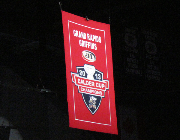
The Griffins, who primarily wear a blue jersey and a white jersey (yeah, they have a red alternate), honor their highest accomplishment with a red banner? I get that it somewhat mimics the design of their banners for “lesser” accomplishments, which are blue with white trim, but it doesn’t make a whole lot of design sense to me.
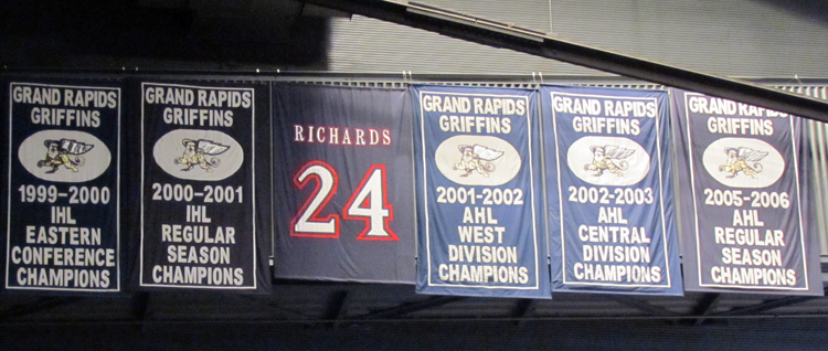
That got me thinking about how even the blue banners have their flaws. Why is the logo inside a white oval when it doesn’t appear that way in any other branding? Why is the banner for Travis Richards’ retired #24 so plain?
I decided to take a crack at redesigning the banners to give them a look that’s not quite as plain but still traditional and respectful of the team’s history.

I keep the blue background but update the border to match the trim pattern of the Griffins’ jerseys for the year the banner was awarded. That means a green border for accomplishments under their affiliation with the Ottawa Senators and a red one for their time with the Red Wings. Rather than including the team name in text at the top of the banner, I use the version of the logo that has the name, and I remove the white oval around the logo since it’s not used anywhere else in the team’s identity. Finally, I remove the league abbreviation because with the year included it’s redundant, as it’s not like the Griffins ever spent a single year in both the IHL and the AHL.
The Calder Cup banner switches the striping pattern to one based on the team’s white jersey, much as the Red Wings do for their Stanley Cup banners. I don’t use the Calder Cup logo so that there will be consistency across multiple Calder Cup wins.
Finally, I take another cue from the Red Wings in redesigning Richards’ retired number banner to look more like a jersey, specifically the jersey he last wore. The top features the now-absent “wings” that adorned the Griffins’ jerseys during Richards’ tenure with the team while the bottom matches the waist striping of those jerseys. Note: I know I didn’t get the number font quite right.
Maybe there’s a reason I’m not seeing for the Griffins’ banners to be the way that they are. I’ve complained before that I wish they actually hung from the rafters rather than from the service walkway on the building’s south side but apparently there’s some reason they can’t hang from the rafters that I don’t know about, so that could be the case here, too. That doesn’t stop me from saying how I’d do it, though.
Related Posts
-
 Sep 20, 2017
Griffins Banner Thoughts
-
 Jan 19, 2012
On Banners in the Joe Louis Arena Rafters
-
Aug 18, 2015
Griffins Unveil New Logo and Jerseys
-
 Sep 7, 2002
Griffins Unveil Detroit-styled Jersey