We learned several weeks ago that the Red Wings would be removing the “Hockeytown” logo from center ice at Little Caesars Arena, with the promise of something new to be unveiled down the road.
Today was that unveiling, as the Red Wings released an updated “Hockeytown” logo alongside new promotional initiatives for the coming season.

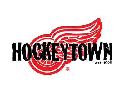
Per the Red Wings…
The logo was designed by Olympia Entertainment’s creative team in conjunction with Troy, Mich.-based SMZ Advertising. The logo was selected following research collected from fans of all ages and Red Wings season ticket holders.
I’m on the record (repeatedly) as disliking the original “Hockeytown” logo. While this is an improvement, it still comes across as extremely lazy to me. As I often said about the original, this one only “says” Hockeytown because the word is literally plastered across the logo.
If they were going to make that same mistake again, I would have preferred to see them use the retro-looking “Hockeytown” logo from the west side of LCA.
Related Posts
-
17 years ago
The End of Hockeytown
-
 6 years ago
Red Wings Abandoning “Hockeytown” Moniker?
-
 4 years ago
On the Yellow Detroit Falcons Logo, or How I Helped Break Red Wings History
-
12 years ago
What makes Hockeytown Hockeytown?: Evil scheming conniving greatness.