-

-

Defender Bard Signs with PWHL Detroit
2 days ago -

-
PWHL Detroit Adds Forward Curl-Salemme
1 week ago -
-
PWHL Detroit Signs Watts to EFO Offer
1 week ago -
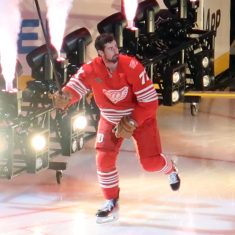
Report: Larkin Requests Trade from Red Wings
1 week ago -
Sciba Named PWHL Detroit’s First Head Coach
2 weeks ago -

-
PWHL Detroit Announces Rheaume as GM
4 weeks ago